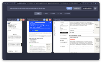
Efficient Responsive Design Testing Tool
Responsive Lab is a Chrome add-on designed to facilitate responsive web design testing by allowing users to view multiple device viewports concurrently. It supports a variety of device sizes, including iPhone, iPad, Android, and Desktop, and enables users to add custom viewport dimensions for tailored testing. The interface allows for easy manipulation of viewports through drag-and-drop functionality, enhancing the comparison process between different devices.
In addition to its core features, Responsive Lab includes the ability to take screenshots of individual viewports at specified dimensions and supports toggling between portrait and landscape orientations. The tool also features dark mode for user comfort during prolonged use, and it processes all data locally, ensuring user privacy and security. This makes it an ideal solution for web developers, designers, and QA testers focused on verifying responsive layouts efficiently.